Today on Hello Healthy we’re digging into pies. It is Pi Day after all.
But before you go grabbing your fork, I should probably clarify that the pies we’re digging into aren’t sweet or savory. Disappointing, I know—but, hey, they’re calorie-free!
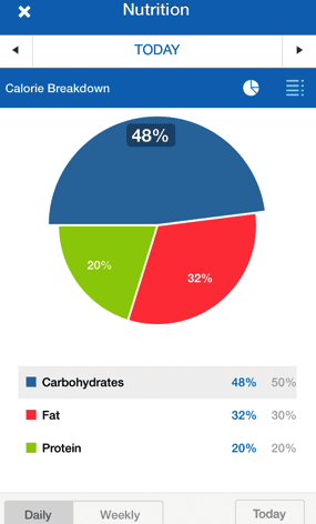
In honor of this silly mathematical holiday, I’d like to give you a little insight into those pie charts in your MyFitnessPal mobile app, and share a few tips for making use of them.
Our Nutrition 101 series explained the three macronutrients that provide us with energy—carbohydrates, protein and fat. The MyFitnessPal pie charts are simply a visual report of how those nutrients contribute to the balance of your diet.
The Institutes of Medicine (IOM) has established recommendations around how many calories carbohydrates, protein and fats should contribute to our diets:
- Carbohydrates: 45-65% of calories
- Protein: 10-35% of calories
- Fat: 20-35% of calories
So how can these pie charts be helpful to you?
As you log foods throughout the day, these pie charts will show the relative amounts of fat, carbs, and protein you have eaten compared to your goal.
MyFitnessPal’s current guided nutrition settings are set at 50% of calories from carbohydrates, 20% of calories from protein and 30% of calories from fat, which fall within those recommended ranges. Of course, if you want your diet to slightly higher in carbohydrates (perhaps you’re training for a triathlon) or higher in protein, these percentages can be adjusted by customizing your goals—but no matter what, the pie chart will always add up to 100%.
Before eating: Adding foods to your diary in advance can help you plan a balanced meal. Start with tomorrow’s breakfast. Once that’s fairly balanced, plan out your lunch. If the numbers in your pie chart don’t change all that drastically, you know you’re on track.
During a meal: Say you log half of a blueberry muffin and a cup of coffee with cream for breakfast. Your carbohydrates might be around 70% of calories, fat 20-25%, and protein 10% of calories. With extra calories to spare, you may want to choose a food higher in protein, like a low-fat yogurt, to make your meal more balanced.
After-the-fact: Looking back at the pie chart at the end of a typical day, or an average week, can give you a bigger picture of the general composition of your diet. If your ratios fall outside of those recommended ranges, you might want to look at them more frequently at mealtime, or meet with a nutritionist who can give you expert insight and tips for eating a more balanced diet.
Keep in mind, every day is different. Heck, every meal is different. Don’t get caught up in trying to hit your exact goals every meal of every day. Instead, use the pie charts as a tool to guide your upcoming meals, help you fill a gap once in a while, or give you a big picture of your diet in general.
For more info, check out our this article on pie charts.
Have you discovered another use for these pie charts? Share it in the comments below!


